


ADXTUR – Aldeias do Xisto Network Tourism Development Agency marks a new stage in the life of the Aldeias do Xisto brand, renewing its visual identity and launching a new website. This new image reflects its strategic positioning and reinforces the identity and noteworthiness of the project. An important step has thus been taken for a brand that represents a territory of union, focused on sustainable development, integrated with nature and communities, and which is an ideal destination for new ways of living, investing and creating.
The world is changing, and the society of the future cannot be thought of without including the villages as essential cells in the vitality of the territories and the development of the country. It is in this sense that this reflection has become so necessary for facing the new challenges and reinforcing the brand's attractiveness. "We have a solid past, a stable network, strong iconography and visual noteworthiness, but it is essential that our graphic identity reflects the strategic positioning of the brand and accompanies the evolution of the project", explains Bruno Ramos, coordinator at ADXTUR.
The Aldeias do Xisto brand is not only its visual and verbal identity, but it is also a set of values with a specific positioning which involves all partners in a perspective of unity and vision of long-term continuity.
"The strategic positioning of the Aldeias do Xisto brand, reflected in its new image, is a step towards the future and the challenges ahead. The values of responsibility, ecocentrism, worldview, experimentation and activism are reinforced and will allow the brand to continue to generate the attraction of its territory, stimulating sustainable and integrated social and territorial development", explains the coordinator.
The new image is based on four axes: Living, Investing, Creating/Learning and Enjoying, whose main objectives are to attract and settle people, projects and investments in the territory. It was therefore important to reinforce, emphasise and specialise the attractiveness of the brand, renewing the image and revitalising the arguments, so that they mirror the real, comprehensive and diversified scope of the project. Watch the video of the public presentation of the Aldeias do Xisto’s new visual identity here.
The brand's digital presence also required a new website. A site that communicates the new positioning, that presents all the resources, events and offers on a map, that organises the navigation flows, giving specific gateways according to themes and interests and, finally, that aggregates and organises the digital flows of the brand's different satellite sites: Bookinxisto, MyXisto Trails, and the new microsites Dark Sky Aldeias do Xisto and Craft+Design.
New Visual Identity
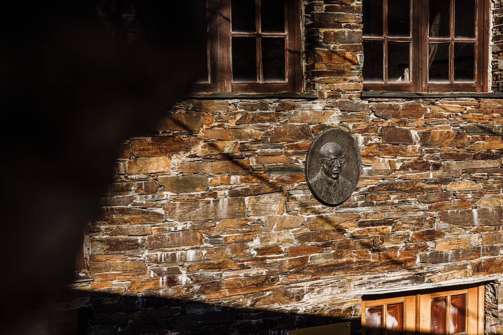
The new visual identity, developed by Atelier Nunes e Pã, is a progression of the existing symbol - "the home", already fifteen years old, which has now been given continuity with a vision of modernity that highlights the trend towards sustainability and the positive experience that the brand seeks to impart on all those who come into contact with it.
"A brand is not only its visual and verbal identity, but it is built upon on a daily basis with experiences, feelings and generosity, attributes that are reflected in our way of being within the organisation. A strategy thought out and applied over the long term empowers the perception of the brand by creating a mental image favourable to its positioning", explains designer João Nunes, from Atelier Nunes e Pã. "This manual will allow ADXTUR and all its partners to create a mental image of unity and uniqueness. We have strengthened the brand, which is now more impactful and a starting point for more contemporary and creative ways of communicating", thus showing "what we are and what we can continue to do in this region".
The new brand is based on geometric shapes drawn from a matrix and is represented by two elements: the Symbol and the Logo. The symbol, a figurative element, is made up of rectangles and triangles which, together, represent a house built with juxtaposed schist stones. The Logo consists of the text that names the Aldeias do Xisto, with the Epura Bold typography created by designer Luis Bandovas for NovaType Foundry, except for the letter X, on the diagonals of the square. A timeless and bold font, round and open that allows for quick and comfortable reading.
The brand's chromatic universe is based on two vectors: timeless and temporary. “Timeless” refers to the strong connection to schist and nature, and “temporary” reflects the seasonality and the various shades offered by these villages´ landscapes throughout the four seasons. Thus, the base colour is black, inspired by schist stone, and the colours are used for the sub-brands.
The claim that "discovery starts here" summarises the promises, motivations and values of the brand, its products, projects and services, guiding people to the essence of the Aldeias do Xisto.
Union, involvement, commitment
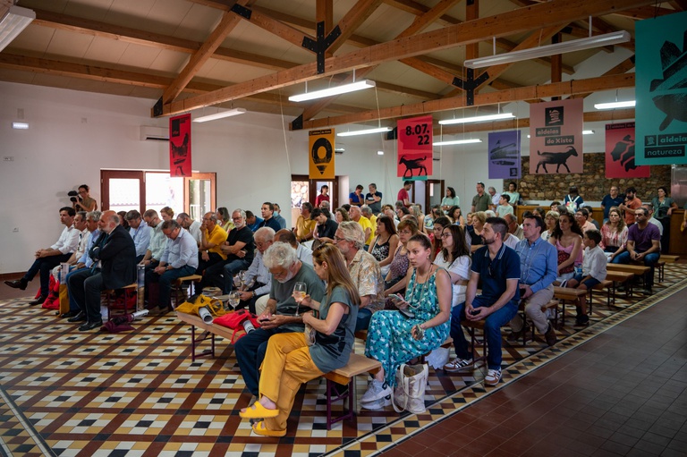
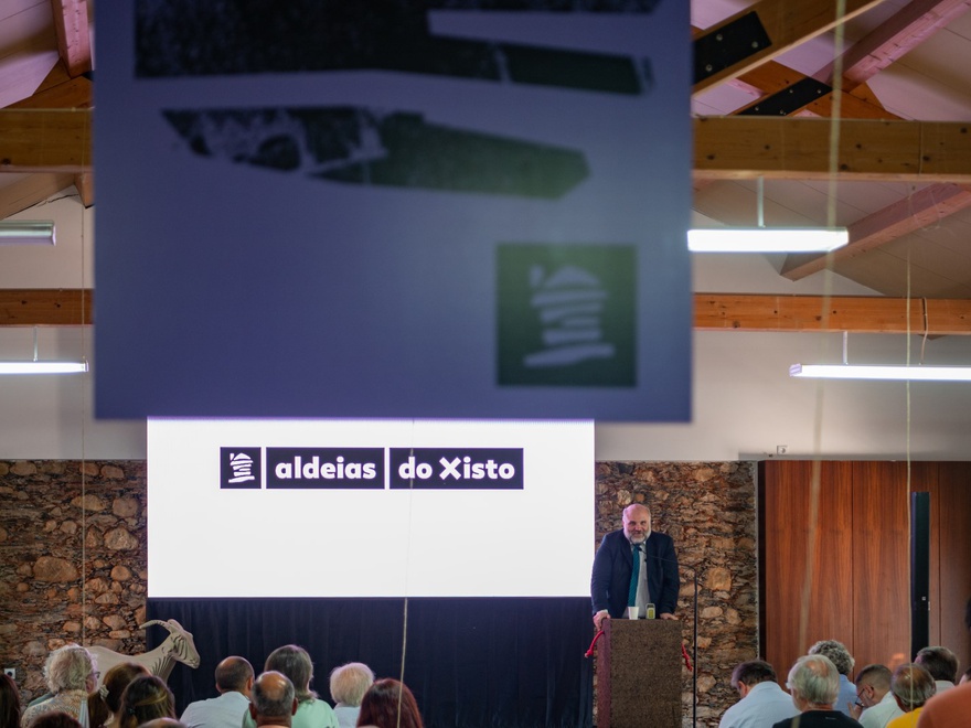
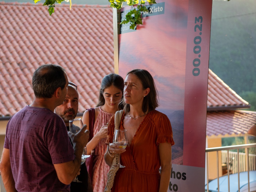
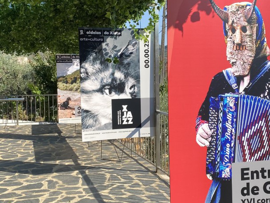
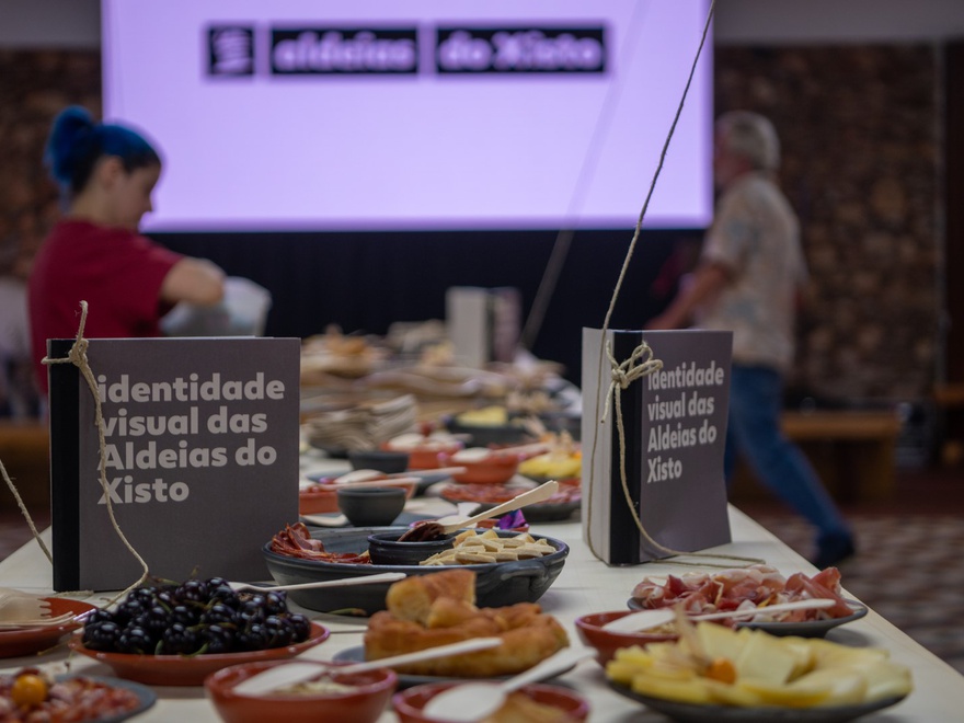
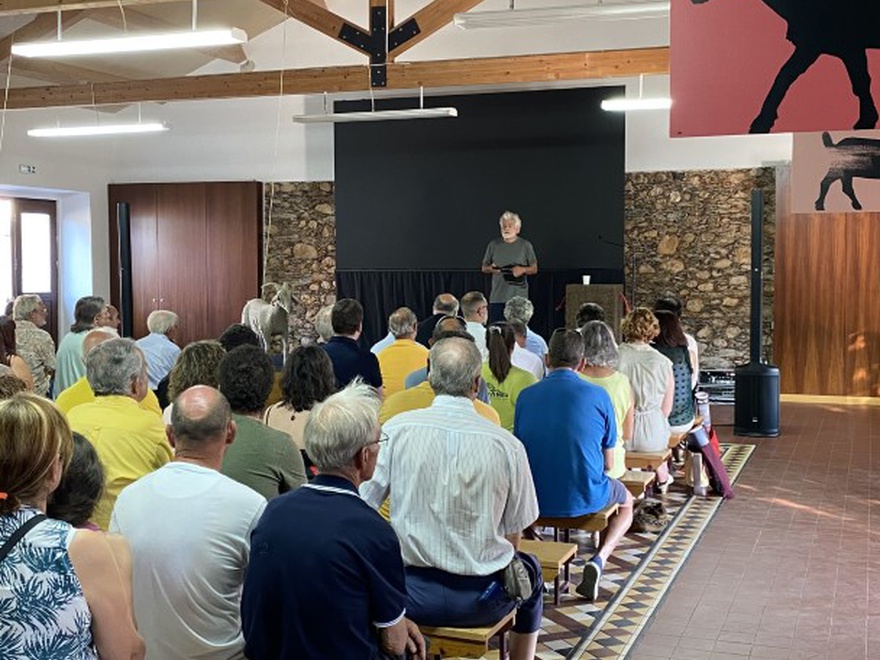
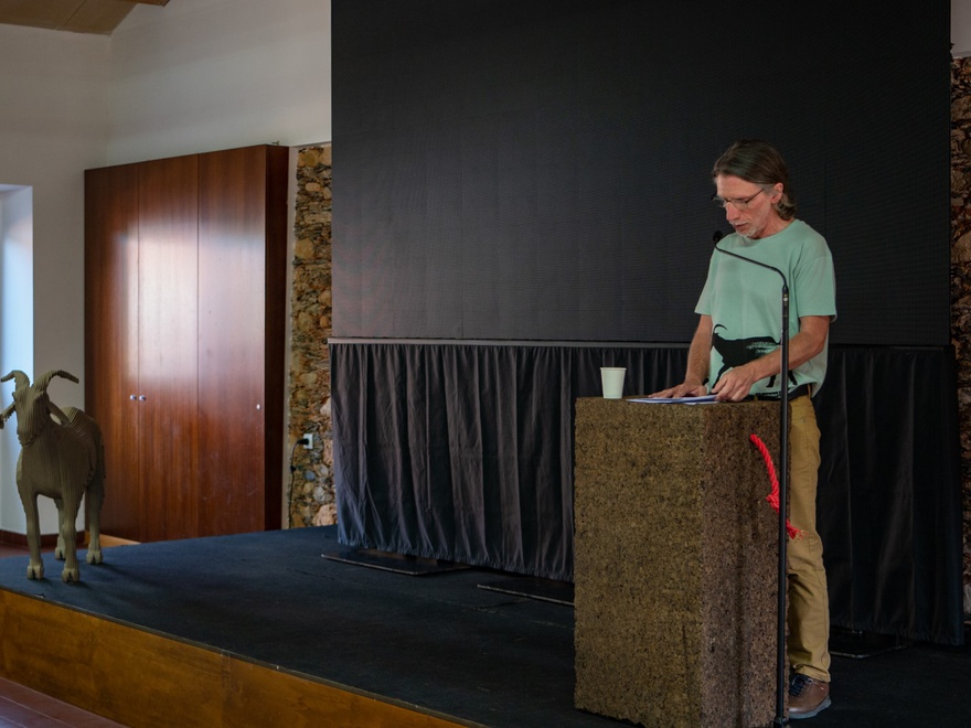
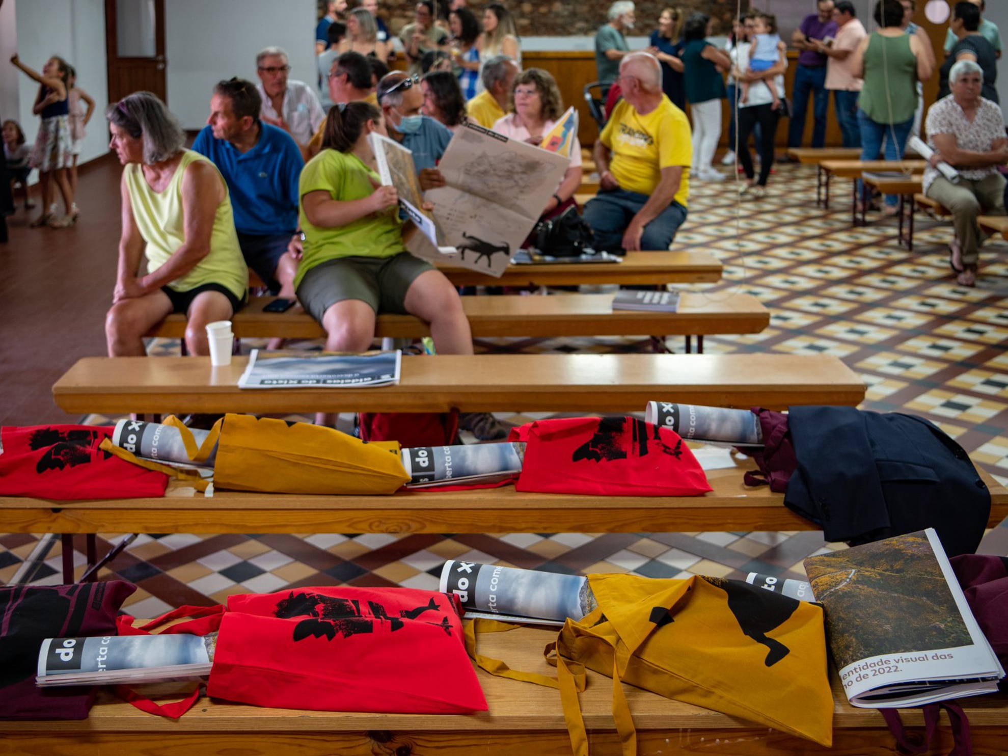
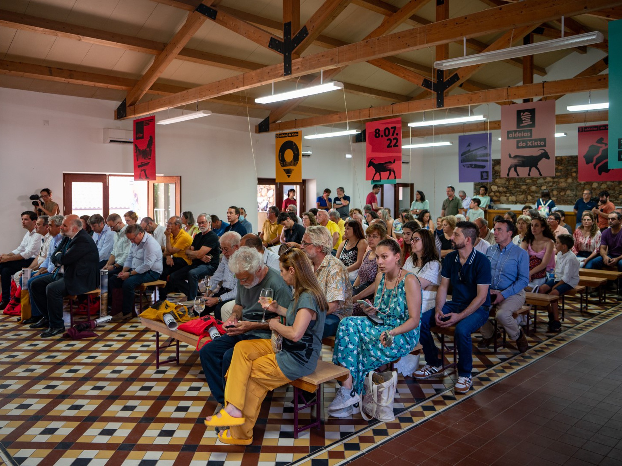
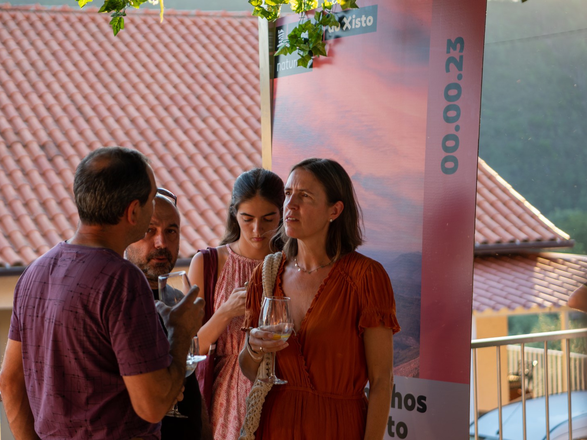
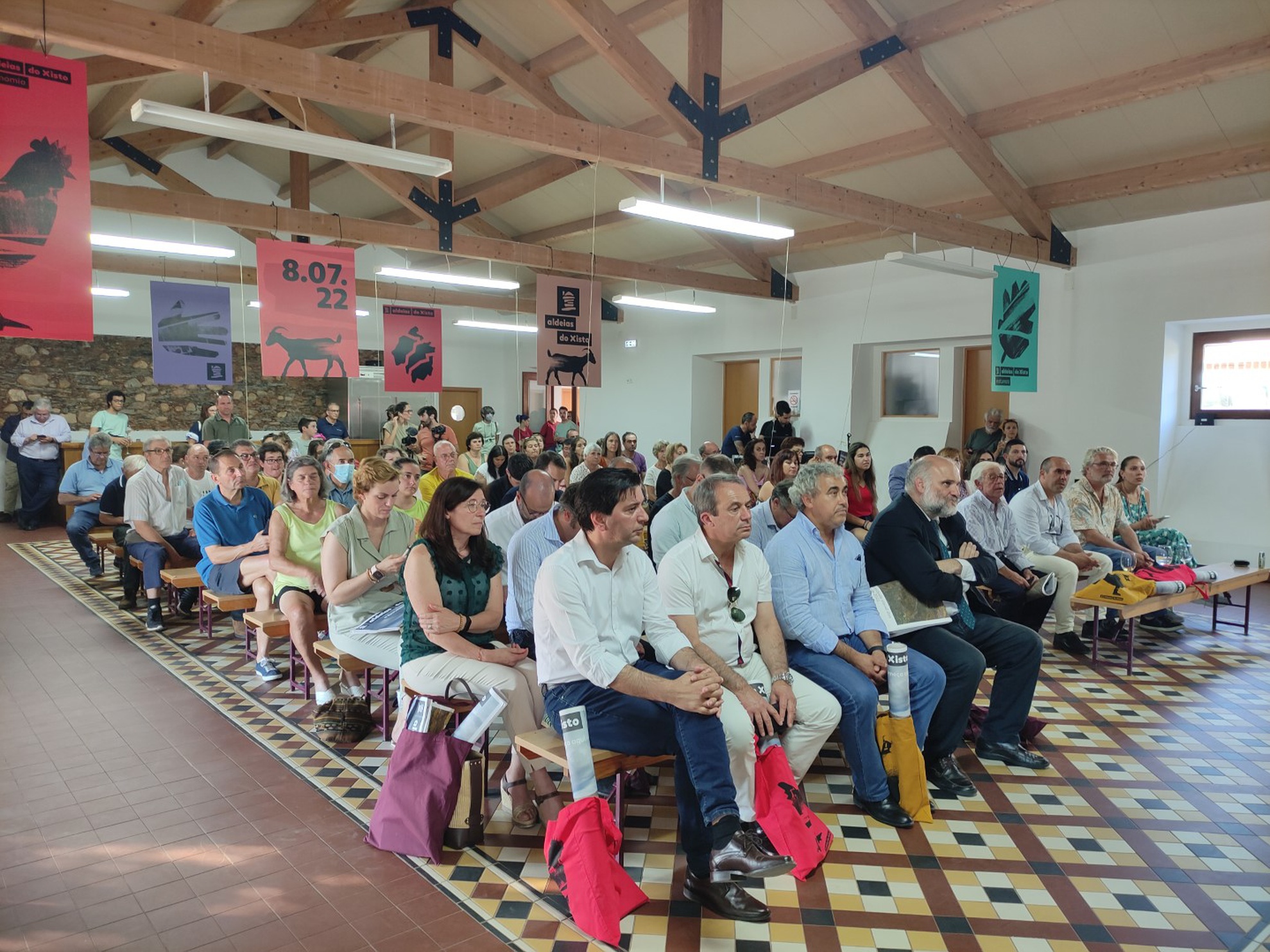
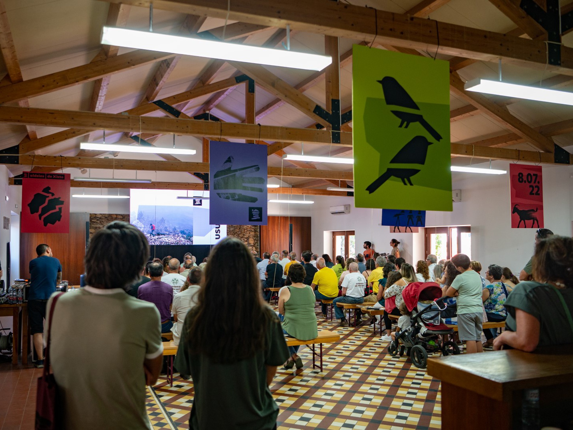
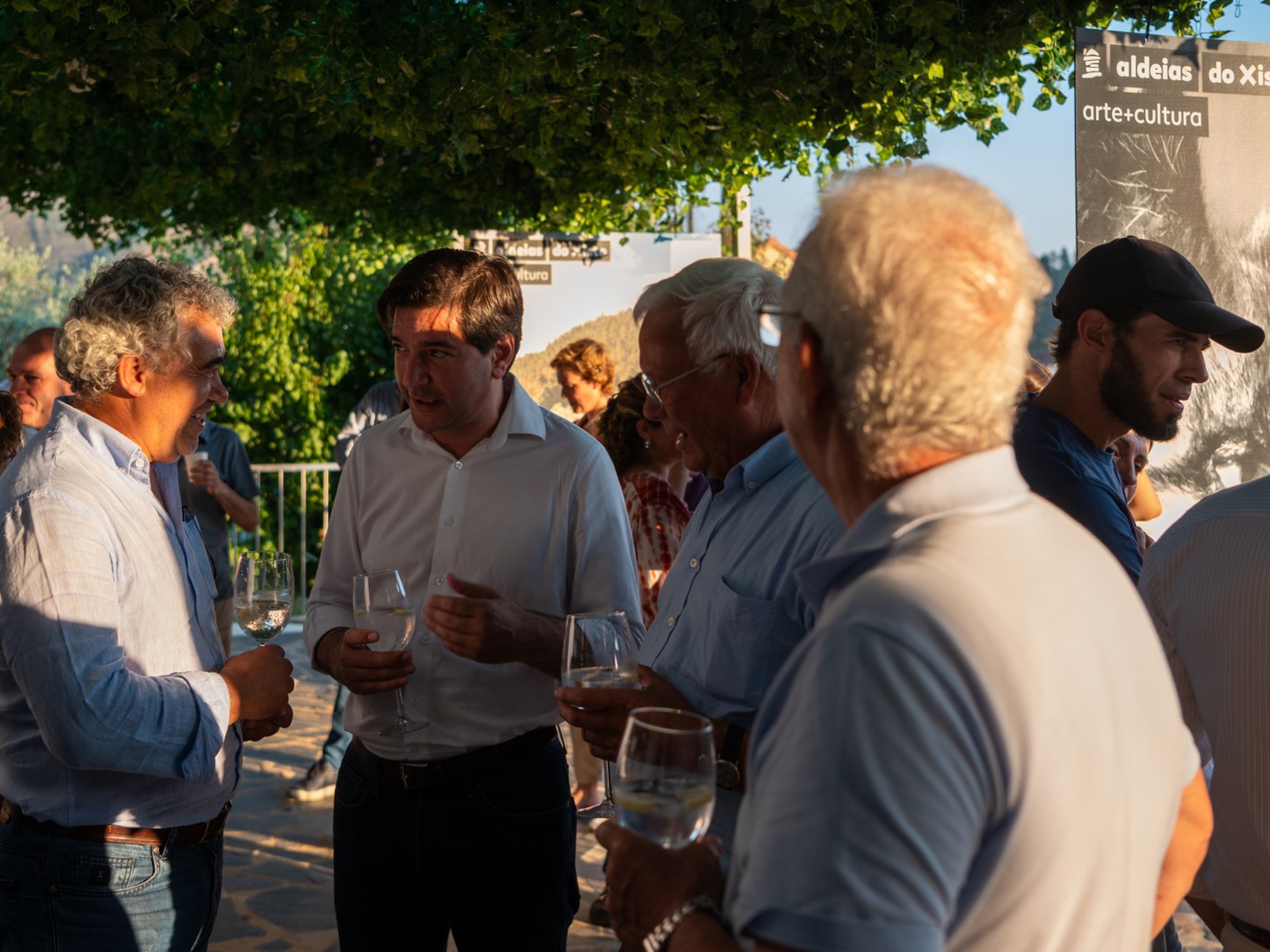
It was precisely this invitation that was clearly evident at the presentation of the new visual identity, which took place in the old Lagar de Janeiro de Cima on 8th July, duly prepared for this moment: the posters and panels hanging throughout the room and on the outdoor terrace made clear the potential of the new image in the promotion of all the tourism products the territory has to offer. It was in this setting that around 150 people came together in an atmosphere of communion, joy and trust, to share another important moment in the history of the Aldeias do Xisto. "All together under the same roof, as equals. The mayor, the regional body, the private agent, the carpenter, the shepherdess, the weaver, side by side", as Bruno Ramos pointed out. "A sign of enormous recognition of what continues to unite us, and of the involvement and commitment we continue to feel with this project and the future of the territory", he added.
Despite the changes, "the identity remains", assured the president of ADXTUR's board, highlighting the "exceptional work" that has been developed. "We didn't change after good things happened, nor did we change after bad things happened. We have always remained coherent and focused on the purposes that a territorial brand should defend", clarified Paulo Fernandes. For him, the way we understand space has changed, so it is necessary to look to the future "with a very open spirit", in a context where emotion is as important as management.
People continue to be the main focus of all the work developed by the Aldeias do Xisto and so every moment seeks to involve the communities. For this event, in addition to cultural entertainment, which included music and stories from the villages, the children of the Janeiro de Cima school were invited to paint "the wall of the future". With the support of the artist Rita Nóbrega, the students made paintings on the wall in front of the mill that convey the values defended by Aldeias do Xisto and the ways of life in which sustainability is an ever-present element.
The Aldeias do Xisto Network includes 27 villages located in the centre of Portugal, in a territory of 5,000km2, divided into four territorial units: Serra da Lousã, Serra do Açor, Zêzere and Tejo-Ocreza. It is a project that currently includes 230 public and private organisations, including 23 municipalities, 5 Intermunicipal Communities, 7 Local Action Groups and more than 150 partners operating in the territory. Together, they contribute to the promotion of rural culture and heritage and the creation of wealth through tourism and cultural services.
They are a set of diverse interests that speak with one voice and whose common goal is the affirmation of the territory. The Aldeias do Xisto do not wait for change to come, they lead the change.